Friday, December 5, 2014

dygraphs 1.1.0

Earlier this week I released dygraphs 1.1.0, a major new release which contains the last ~15 months of work. The dygraphs site is running it. You can learn more about hosted versions and installing it with NPM or bower from the download page.

There have been far too many changes to cover them exhaustively, but here are a few highlights.

dygraphs is now "retina" compatible

As anyone with a "retina" screen will tell you, low resolution graphics really stand out. Resolution independence is a natural advantage for SVG charting tools like D3. To get crisp charts on high resolution screens, dygraphs creates a larger canvas which is scaled down to fit the logical pixels on your screen. A big thanks to Paul Holden for his work on this.


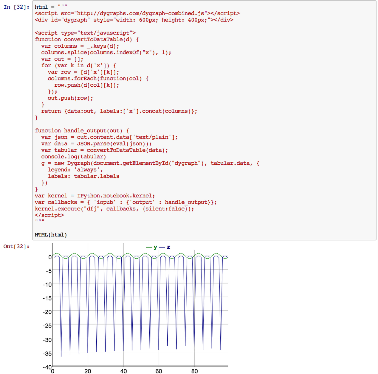
Using a non-existent option now throws

dygraphs has a lot of options. Previously, if you had a typo in one of your option names, dygraphs would silently drop it. With 1.1.0, if you source dygraph-combined-dev.js,  an invalid option or series name will throw. Say goodbye to mysterious misconfigurations!


More sensible date ticks

dygraphs has displayed ticks like "Jan 08" (for January 2008) and "29Jan" (for January 29th) since it was first released. As we entered the current decade, the former has become a source of confusion: does "Jan 12" mean January 12th or January 2012? With this release, dygraphs uses the more sensible formats "Jan 2008" and "29 Jan".

Dramatically improved performance for filled charts

If you're plotting a million points on a 1000px wide chart, there's no sense in drawing all of them (this is called "overplotting"). For many years, dygraphs has dropped segments on line charts which would have no visible impact. This was not true for filled charts, however. If you turned a line chart into a filled chart, you could easily see a 1000x slowdown. For this release, I reworked the drawing code for filled charts and added the dropped point optimization. Click that link to see a diagram.

x-axis log scales

Previously you could only have log scales on the y-axis. Now you can have them on the x-axis! This allows log-log plots. Thanks to kberg for making this happen.

The labelsUTC option forces UTC formatting for all labels

Time zones are a mess. Sometimes you just want to use UTC and pretend they didn't exist. And now you can! Set the new labelsUTC option and specify your dates using either ISO-8601 format or new Date(Date.UTC(...)). Thanks to joanpau for contributing this great new option!

The new DataHandler system allows for more flexibility in data loading

DataHandlers unify the way that dygraphs loads and processes data. This API is exposed via the dataHandler option, and it should allow dygraphs users to create their own custom data formats. You can read more about this feature in its design doc. Stay tuned for a blog post exploring this! Thanks to David Eberlein for this.

"this" is set to the dygraph in all callbacks

dygraphs has more than a few callback options. Some of them take the relevant dygraph object as a parameter while others don't. In retrospect this was poor API design, but it's a design that we're stuck with. Most JavaScript libraries pass a relevant object to functions via this and now dygraphs does the same.

You can now get a reference to the relevant dygraph from any callback via this.

dygraphs has also shrunk, because we moved some stuff into "extras" (133kb→122kb). Hopefully this won't affect you, but if it does, you can find the missing functionality in that directory.
This will be the last release of dygraphs which supports older versions of Internet Explorer. We've already begun ripping out the shims for older browsers. Expect a leaner, meaner dygraphs soon!

Finally, a big thanks to everyone who contributed to this release. GitHub lists an amazing 54 contributors to dygraphs over the years!

Monday, October 20, 2014

dygraphs issues on GitHub

I've moved the dygraphs issue tracker from Google Code over to GitHub issues. The new issues link back to the old, though not vice versa.

My hope is that moving to GitHub will increase community involvement, since it's a more familiar, modern system.

The migration process was fairly painless. I used a tweaked version of the google-code-issues-migrator and took inspiration from beet's moving from Google Code to GitHub: a horrible, ultimately rewarding odyssey.

Tuesday, September 9, 2014

PyDyGraphs, a dygraphs plotting module for IPython Notebooks

(Guest post by Zach Dischner)

PyDyGraphs on Github (mostly written by Kevin Dinkel)

The IPython Notebook is an excellent tool for interacting with Python and displaying data in real time. While tools like matplotlib can generate static plots in an IPython Notebook, we often find their plots to be slow to render and the minimal interactivity limits their usefulness in practice. Being a long time fan of dygraphs, we wrote a module to render the JavaScript plots in the Notebook. This module can be readily included in an IPython Notebook and then used to generate beautiful, fast, and interactive time series plots with dygraphs, all stored locally with no need for remote hosting.

Screen Shot 2014-09-08 at 11.06.55 AM.png

PyDyGraphs is far from mature, but what proved to be a simple effort of integrating the DyGraphs library into the Notebook environment has already been enormously useful and fun to use. The whole thing only took a day or two to write, and has become my new go-to plotting tool for time-series data.

Purpose


Originally, PyDyGraphs was meant as a Pandas Dataframe plotter. The Dataframe is a powerful data structure, and the lack of an adequate visualization tool lead to the creation of the PyDyGraphs plotting module. The Dataframe is already a relational data structure, and is easily provided to Dygraphs for visualization. Support for typical time series arrays has been added, but those simply get translated to DataFrames along the way.

I am one of the lead software developers and main instrument operator on the BRRISON/BOPPS high altitude balloon mission. With flight times on balloon missions potentially being limited to hours, immediate and intuitive interpretation of flight telemetry is absolutely essential in order to make the fast decisions needed to maximize achievement of science goals. We found that matplotlib figures were simply too slow and too static for our needs. Hence PyDyGraphs! We created the module to follow the same basic behavior as matplotlib, but give you much of the awesome functionality of dygraphs.

Enough words, here are some examples.

2x2 subplot


Similarly 3x3 Plot


How it Works


At its core, this module creates a JavaScript string for use within an IPython Notebook. It takes advantage of the Notebook’s built in “Kernel” and “Callback” JavaScript interactivity tools to get data between Python and JavaScript. We based it off of this SO question (thanks danvk!)


Conclusion

PyDyGraphs is a simple, easy to use wrapper of the epic dygraphs plotting library. We are using it for personal and professional projects, and are just plain stoked about being able to mix Python/dygraphs.

For more examples, check out our github: https://github.com/DayStarEngineering/PyDyGraphs

There are plenty of todos and ideas, so feel free to fork and contribute.

Monday, June 23, 2014

dygraphs as an NPM package

dygraphs is now available as an NPM package.
NPM is the NodeJS package manager. It works well enough that it's used for all sorts of packaging, even when NodeJS isn't involved.

To install dygraphs via NPM, simply run:
npm install dygraphs
This will install dygraphs under a node_modules directory, for example:
ls -lh node_modules/dygraphs/dygraph-combined.js 
Once you've got it installed, you can source it from that location in your web page, web server, Python program, whatever.

If you create a package.json file, you can specify a specific version of dygraphs that you'd like to depend on. That way, you can keep getting a compatible version in the 1.x series, even after we move on to 2.x.