Monday, January 16, 2012

Introducing the Dygraphs Gallery

I'd like to introduce you to the new Dygraphs Gallery, which can be found at http://dygraphs.com/gallery. We've taken some of the existing tests, cleaned them up a bit, and put them into a single easy-to-use web application.

In 2009, Dygraphs' tests directory was used mostly for verifying that the code hadn't broken, by examining each 'test' one at a time. The list of tests grew to over seventy strong. With the advent of the Dygraphs automated test framework, the tests directory was less a home for validating behavior (which, anyway, became rather unwieldy with so many of them) and more of a showcase of what's possible in small, discrete packages.

So rather than have a series of independent files, we modeled the gallery after the GWT Showcase, including showing the code required to make the demo.
The code behind each demo is there for your perusal.
With the new Gallery, the old-fashioned Dygraphs tests face a different future, either being turned into Gallery demos, automated tests, or deleted outright.

The Dygraphs Gallery is brand new, and we have more demos and features to add. If you have any thoughts on the matter, don't hesitate to let us know on the mailing list, or, as always, contributions are welcome.

Sunday, January 8, 2012

New Dygraphs Toy: the Palette

Happy New Year! I've been working on this for the last few days and am super excited it's finally ready to show. If you've wanted to learn how Dygraphs options work, then this will probably excite you too: the Dygraphs Options Palette, available at dygraphs.com/experimental/palette. It's easy, fun, and useful.

I've tested it with Chrome and Firefox/OSX. If you have a different browser, please give it a shot.

Major Features:
  • Make changes to a graph, live.
  • Support for most Dygraphs options (see below for details)
  • Live interaction with several predefined data sets.
  • Supports almost all Dygraphs data types, including string, int, float, boolean, string array, int array, boolean array, and function. (DOM element and dictionary are missing.)
  • Pretty integrated option help.
  • Designed with simple user experience in mind.
What's Left:
  • Not all options are supported. Some options, like labelsDiv and interactionModel are probably easy to support, but axis-specific options require more work.
  • While you can use one of the canned data sources, this palette should really work with user-supplied data sources.
  • Support for other browsers.
  • Exporting a set of options as a URL, or even a Javascript code snippet.
  • Graduate the palette into a full-featured library which can be easily applied to live graphs.

Stop reading, and go play with the options palette, available at dygraphs.com/experimental/palette. Feedback is welcome, and code is too.

Screen Captures


You can filter down the gigantic set of options and apply them appropriately.

In this example I've taken the basic graph and set the options drawPoints: true and pointSize: 5
And now I've changed the series colors using  colors: red, green, blue, black.

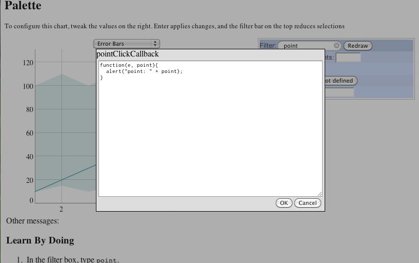
And can set all kinds of values, even callbacks.

And there's lots of tooltip help. Just hover over the lines.

Saturday, January 7, 2012

New Developer Feature: easier localized testing

If you're developing for Dygraphs, then you should know that we like tests. We've currently got 93 automated tests in the github repository (found at auto_tests/tests) and built an automated test suite thanks to JSTestDriver. We strongly encourage people to run the test suite when making Dygraphs changes (which is well documented in auto_tests/README.)

However, I've made interim testing much simpler. If you're not already familiar with auto_tests/misc/local.html, it's a hacked-down version of the automated test framework that you can easily run locally in any browser. This is particularly useful for debugging a broken test.

However, debugging those tests required a javascript console, and you had to know the name of the test you wanted to run. Now it's much simpler, as local.html will present you with a list of all test cases you can choose to run.


From there you can select an individual test case. Here, I've selected "to-dom-coords":


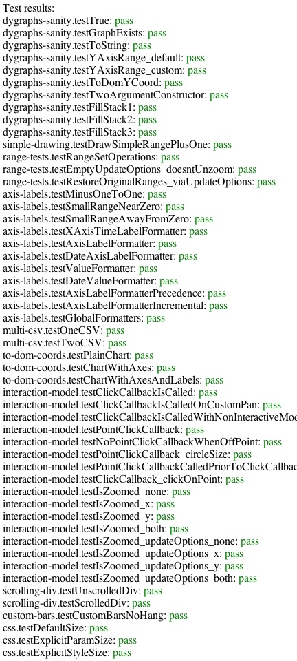
You can run one test, or all of them. Below you can see the results of running all the tests, with the output of the last test still on the document.

But if you want, you can run all the tests from all the cases!
And you'll get a long list of results to peruse at your pleasure.


Keep in mind that in-browser testing is not as thorough a test as running through JSTestDriver. This means that you still need to run the automated test suite when you can.

(Note: I know this works with Chrome, it might not work with your browser. Please let me know if it doesn't, or better, submit a patch!)

Thursday, December 29, 2011

dygraphs 2011 year in review

It's been a big year for dygraphs!

Looking back at the last 365 days in the commit log, there were 356 commits. A big "thank you" to everyone who contributed:

  • danvk (207 commits)
  • kberg (107 commits)
  • nealie (13)
  • jeremybrewer (9)
  • antrob (8)
  • flooey (6)
  • paul felix (3)
  • bombela (1)
  • ben winslow (1)
  • Lee (1)

One thing I learned this year is how to better manage the commit history on the master branch. So those counts may understate the contributions of people like Paul who contributed later in the year.

So what changed? The flashy stuff first! Here were the new features:

It's also been a year of greatly-improved documentation. Some of the biggest wins here have been:

Finally, some of the biggest changes happened behind the scenes. kberg and I both learned a lot about JavaScript this year and used that knowledge to improve the dygraphs development process. The biggest changes in this category are:

auto_tests (kberg gets a dygraphs gold star for this one). Automated tests help us prevent unexpected side-effects from changes, as well as regressions. We had no automated tests at the start of the year, but now we have 83. This is good news for users as well as developers, who can make changes with a lot less fear than they did a year ago. Another gold star goes to Cory Smith for developing JSTD.

We also learned about the new "script mode" in ECMAScript 5, which tells the browser to complain when you use certain JavaScript features like global variables. All of dygraphs' JS files now run in strict mode and pass through jshint, a JavaScript linter. This will also help keep us from shooting ourselves in the foot.

There have been many other internal changes — we fixed a bajillion bugs, and antrob made some contributions which resulted in significant speedups for large charts.

So where is dygraphs going next? Here are some areas I'd like to work on next year:

  • Improved auto_test coverage
  • More intuitive/discoverable interactions
  • Nicer-looking charts
  • Better warnings when you misconfigure a Dygraph
  • Customized interactions for touch-screens
  • Speed improvements (maybe by using WebGL and reducing internal copying)
  • Improving dygraphs.com

All-in-all, 2011 has been a great year for dygraphs. Here's hoping that 2012 will be even better!

Tuesday, October 4, 2011

Dygraphs Coordinate Systems, 3/3

This is the last of three posts about the coordinate systems used throughout Dygraphs.
  • Part 1: Introduction and the Dygraph Data Coordinate System
  • Part 2: DOM Coordinate System
  • Part 3: Percentage Coordinate System
Dygraph Percentage Coordinate System

Update: Yes, it's really the fraction of the drawable area (from zero to one) rather than a percentage (0 to 100.) If we rename the methods, I'll update this post.

There’s an additional coordinate system which represents percentages from the edges of the drawing area, relative to upper-left corner. These aren’t often required for public API, but can be useful when having to work strictly in the viewable area of the canvas. This is different than the DOM coordinate system which has its origin off the viewable area of the canvas. In this case, this coordinate system is all about the viewable area of the canvas.

These are accessible by the methods toPercentXCoord and toPercentYCoord.

toPercentXCoord takes a data X data value and converts it to a percentage from the left edge of the canvas. This diagram gives you an idea:
And to hit the point home, here’s a snippet of code which demonstrates values created by this function:

for (x = 1; x <= 9; x++) {
 console.log(x, '=>', g.toPercentXCoord(x));
}
1 "=>" 0
2 "=>" 0.125
3 "=>" 0.25
4 "=>" 0.375
5 "=>" 0.5
6 "=>" 0.625
7 "=>" 0.75
8 "=>" 0.875
9 "=>" 1


toPercentYCoord does the same thing along the Y axis, but goes from top to bottom.
The drawing area along the y-axis goes from 0-131, so let’s look at toPercentYCoord.

g.toPercentYCoord(0)
1


g.toPercentYCoord(131)
0


g.toPercentYCoord(120)
0.08396946564885496


g.toPercentYCoord(65.5)
0.5

Converting percentages back to data coordinates can be performed with this function:


function(pct) {
  var range = g.xAxisRange();
  return ((range[1] - range[0]) * pct) + range[0];
}

and a similar one for y-axis conversion. Validation is left up to the reader.

Summary

Each coordinate system has its own origin:
  • The Data coordinate system has its initial origin in the lower left corner, with increasing values moving up and to the right. This doesn’t mean the lower-right corner is (0,0), since the graph can be moved or resized.
  • The DOM coordinate system has its origin in the upper left corner of the unclipped canvas, with increasing values moving down and to the right. This is not the same corner as the percentage coordinate system. However, you are limited to drawing inside the graph area.
  • The percentage coordinate system has its origin in the upper left corner of the clipped canvas, with increasing values moving down and to the right.

API that can be used for translating between these coordinate systems are:
  • toDomXCoord and toDomYCoord convert data coordinate values to DOM coordinate values
  • toDataXCoord and toDataYCoord convert DOM coordinate values to data coordinate values
  • toPercentXCoord and toPercentYCoord convert data coordinate values to canvas percentages.

Monday, October 3, 2011

Dygraphs Coordinate Systems, 2/3

Update: 8:30AM Oct 4: to clarify several items.

This is the second of three posts about the coordinate systems used throughout Dygraphs.
  • Part 1: Introduction and the Dygraph Data Coordinate System
  • Part 2: DOM Coordinate System
  • Part 3: Percentage Coordinate System

DOM Coordinate System

Another coordinate system is the DOM coordinate system, which maps to coordinates of the underlying canvas.

(DOM coordinates are useful for mouse event handling. drawing on the underlay canvas, to name two things.)

DOM coordinates typically have (0,0) in the upper-left corner. While you might expect the corner to be in the drawing area, you’ll be surprised where that corner precisely is.


The Dygraph canvas coordinates don’t begin and end in what you would think of as the drawing area. No, in fact the canvas is widened to take up the space of the entire parent div element.

(People not familiar with Dygraphs may not realize, but the labels themselves are not canvas-drawn. They're part of the HTML DOM. As someone who had to understand these coordinate systems the DOM coordinate origin was a surprise. Other graphing systems draw their labels right on the canvas, e.g. http://code.google.com/apis/chart/, Dygraphs' does not.)

Note: A demo of a Dygraph without axis, using the full parent div element for its drawing area can be found at http://dygraphs.com/tests/unboxed-spark.html.

Clipping and other hackery

Here's an example that will help bring home home the difference between the full canvas area and the area exposed to the user, by way of a fun example, by showing how the image above was drawn:


g.updateOptions({
 underlayCallback: function(ctx) {
   ctx.canvas.width = ctx.canvas.width; // 1
   for (var y = 0; y <= 350; y += 50) {
     ctx.moveTo(0, y);
     ctx.lineTo(500, y);
     ctx.stroke();
   }
   for (var x = 0; x <= 500; x += 50) {
     ctx.moveTo(x, 0);
     ctx.lineTo(x, 350);
     ctx.stroke();
   }
}});


The line marked // 1, above is important. When the underlayCallback is called, it hands the caller a pre-initialized canvas context such that anything outside the graph area is clipped. (Having a clipping area is useful for graphing lines that exceed the boundaries of the clipped viewport.) A statement like // 1 reads like a no-op, but it has a side-effect of resetting canvas context, clearing the viewport, making that drawing possible. This is what the graph looks like without line // 1:

I hope you see now that (0, 0) doesn't represent the corner of the drawing area, but some spot which is fundamentally inaccessible to the user.

Note: Please don’t use this trick in graphs and applications you care about. This is only a hack for demonstrative purposes.

Conversion methods

The Dygraphs API comes with methods for converting between Data coordinates and Canvas coordinates

toDomXCoord converts from data X coordinates to DOM X coordinates


for (x = 1; x <= 9; x++) {
 console.log(x, '=>', g.toDomXCoord(x));
}
1 "=>" 56
2 "=>" 110.875
3 "=>" 165.75
4 "=>" 220.625
5 "=>" 275.5
6 "=>" 330.375
7 "=>" 385.25
8 "=>" 440.125
9 "=>" 495


toDomYCoord converts from data Y coordinats to DOM Y coordinates

for (y = 0; y <= 120; y+=20) {
 console.log(y, '=>', g.toDomYCoord(y));
}
0 "=>" 330
20 "=>" 279.618320610687
40 "=>" 229.23664122137407
60 "=>" 178.85496183206106
80 "=>" 128.4732824427481
100 "=>" 78.09160305343512
120 "=>" 27.709923664122137

and toDataXCoord and toDataYCoord convert X and Y values from the DOM coordinate system to the Data coordinate system.


g.toDataXCoord(56)
1
g.toDataYCoord(330)
0

Sunday, October 2, 2011

Dygraphs Coordinate Systems, 1/3

This is the first of three posts about the coordinate systems used throughout Dygraphs.
  • Part 1: Introduction and the Dygraph Data Coordinate System
  • Part 2: DOM Coordinate System
  • Part 3: Percentage Coordinate System
Introduction
This series of articles covers the three primary coordinate systems used in Dygraphs. They are: data coordinates, DOM coordinates, and percentage coordinates.

Each has its own distinct rules about origins and directions.

The entire series is based on this graph:


which is generated by this snippet of code:

new Dygraph(document.getElementById("graph"),
    [
      [1, [10,  10, 100]],
      [2, [15,  20, 110]],
      [3, [10,  30, 100]],
      [4, [15,  40, 110]],
      [5, [10, 120, 100]],
      [6, [15,  50, 110]],
      [7, [10,  70, 100]],
      [8, [15,  90, 110]],
      [9, [10,  50, 100]]
     ], {
       width: 500,
       height: 350,
       customBars: true,
       errorBars: true
     });

Dygraph Data coordinate system

The most obvious coordinate system to dygraphs is its inherent data coordinate system. The best way to demonstrate that coordinate system is through an example:

This highlighted point can be represented by the data coordinate system (4, 40). We’re even aided by the display on top showing the currently selected point.

Not to put too fine a point on it, but the x-value is 4, and the y-value is 40.

Graph data is always specified in the data coordinate system, and dygraphs does the job of translating those into points on the canvas. This should be no surprise to you, reading the code above shows the middle value for x=4 is 40.

This doesn’t always mean that the origin is in the lower-left corner of the graph area, since a graph can be resized and moved, but values almost always increase up and to the right.#

Before moving on to the next coordinate system, let’s play with the graph and its API. You can skip this section if you’re already comfortable with pulling values out of the graph.

Sidebar: Extremes and Visual Ranges

Extremes

Dygraphs provides a function that describes the extremes, or minimum and maximum data values, of the x-axis with xAxisExtremes:
g.xAxisExtremes()
[1, 9]

There is currently no yAxisExtremes function but Dygraphs an open source project; contributions are always welcome.

Visible Ranges

xAxisRange shows the visible data range along the x axis:
g.xAxisRange()
[1, 9]

Similarly yAxisRange shows the visible data range along the specified y axis:
g.yAxisRange()
[0, 131]

You’re wondering why the y axis range ends at 131 and not 120. This is because Dygraphs automatically adds a buffer to the top of most graphs’ y ranges for improved readability.
If you want the range to be precise, you can use the valueRange option with g.updateOptions({valueRange: [0, 120]}):

(Note there is currently a rendering bug where setting the value to 120 does something funny. This graph was rendered with a value range of 0-120.1.)

Remember these are visual ranges and not extremes of the data. So panning a graph along the x axis would result in a change in the x-axis range, but not x-axis extremes.