There have been far too many changes to cover them exhaustively, but here are a few highlights.
Friday, December 5, 2014
dygraphs 1.1.0
There have been far too many changes to cover them exhaustively, but here are a few highlights.
The
Monday, October 20, 2014
dygraphs issues on GitHub
My hope is that moving to GitHub will increase community involvement, since it's a more familiar, modern system.
The migration process was fairly painless. I used a tweaked version of the google-code-issues-migrator and took inspiration from beet's moving from Google Code to GitHub: a horrible, ultimately rewarding odyssey.
Tuesday, September 9, 2014
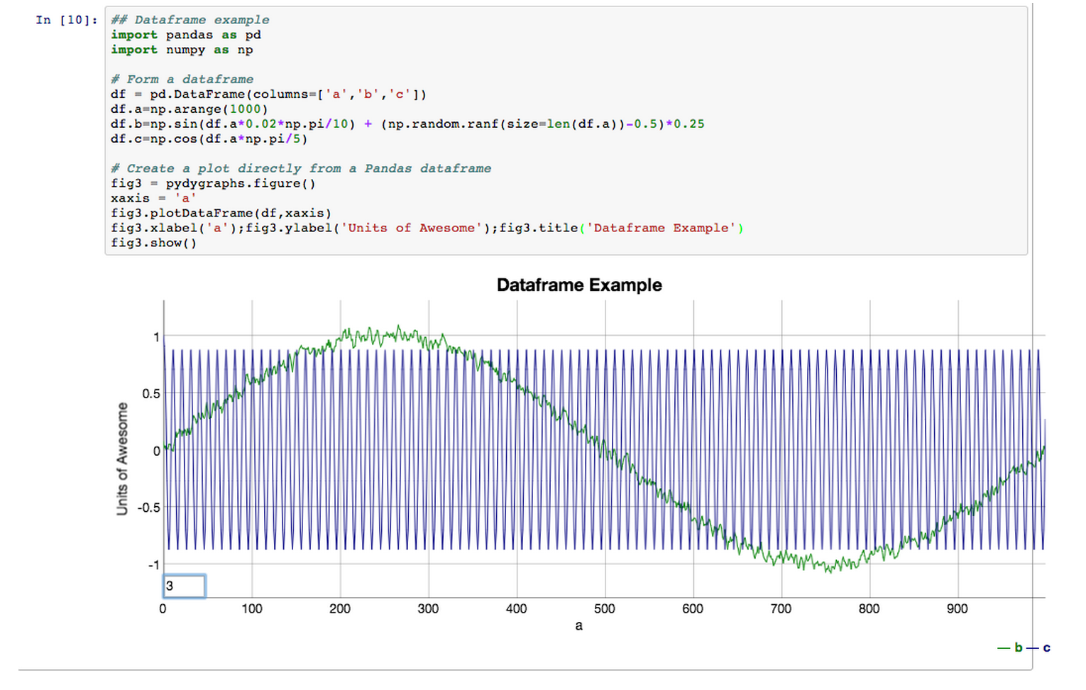
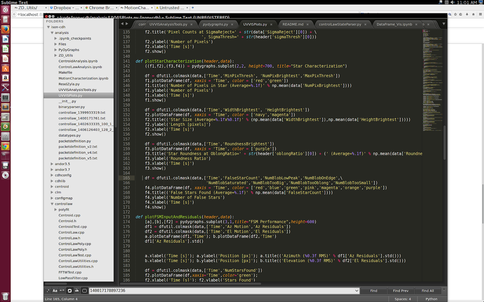
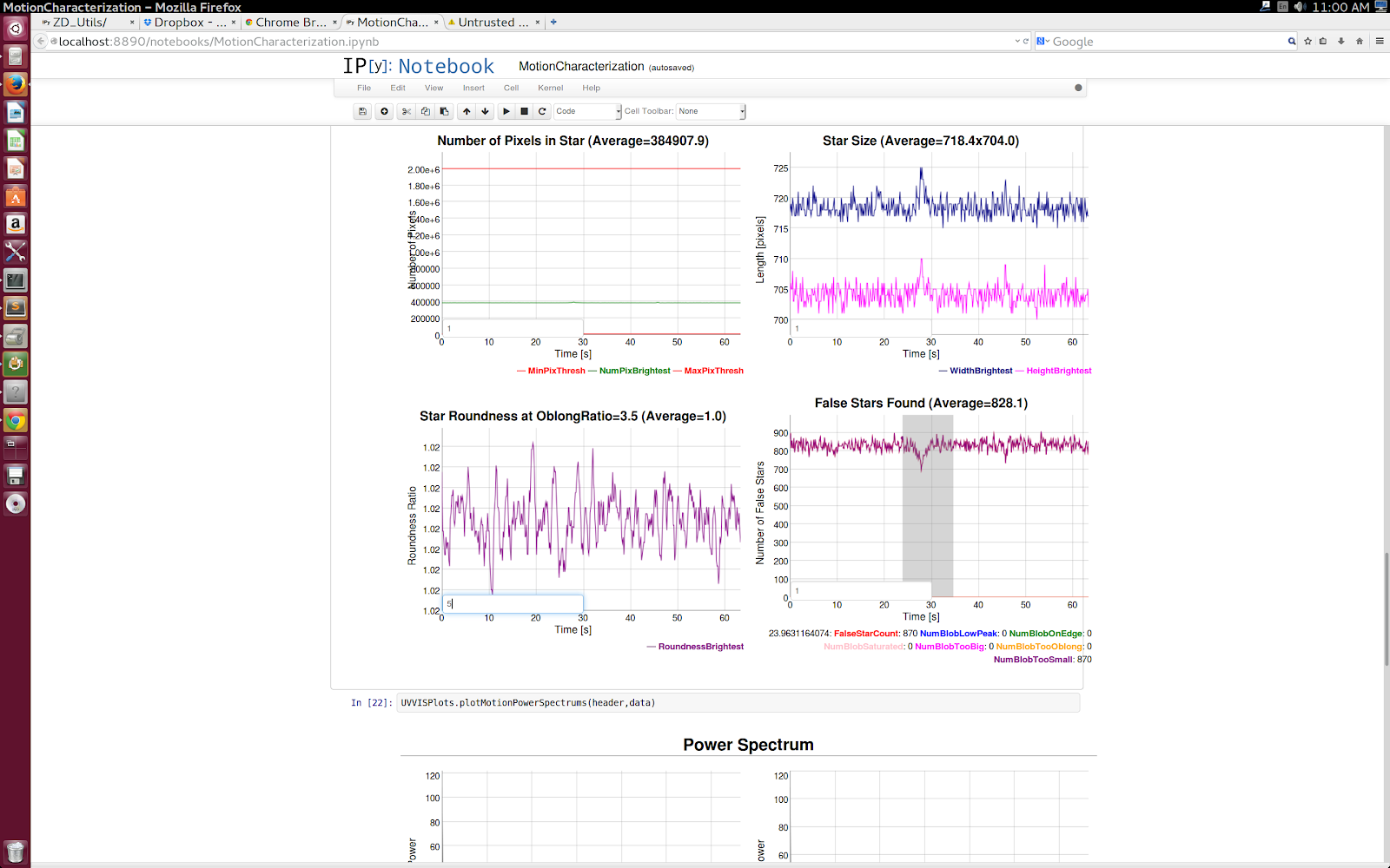
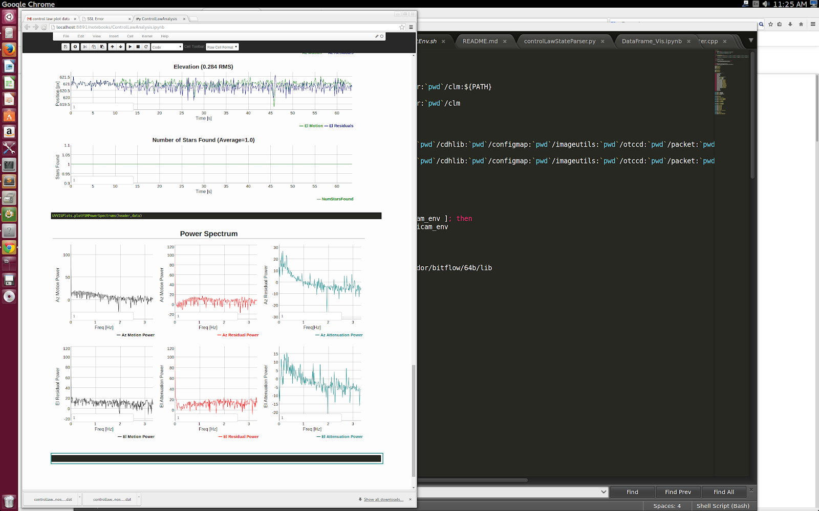
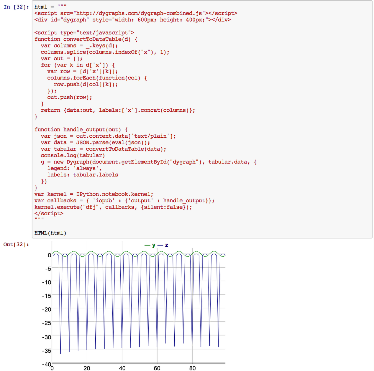
PyDyGraphs, a dygraphs plotting module for IPython Notebooks
Purpose
How it Works
Conclusion
Monday, June 23, 2014
dygraphs as an NPM package
NPM is the NodeJS package manager. It works well enough that it's used for all sorts of packaging, even when NodeJS isn't involved.
To install dygraphs via NPM, simply run:
npm install dygraphs
This will install dygraphs under a node_modules directory, for example:
ls -lh node_modules/dygraphs/dygraph-combined.js
Once you've got it installed, you can source it from that location in your web page, web server, Python program, whatever.If you create a package.json file, you can specify a specific version of dygraphs that you'd like to depend on. That way, you can keep getting a compatible version in the 1.x series, even after we move on to 2.x.
Wednesday, August 14, 2013
Announcing dygraphs 1.0.0!
While this means that you’ll still have access to the very latest source, there will always be permanent, stable resources available for 1.0.0:
- Minified code: http://dygraphs.com/1.0.0/dygraph-combined.js
- Documentation: http://dygraphs.com/1.0.0/
- Source: https://github.com/danvk/dygraphs/tree/release-1.0.0
Brief History of dygraphs
For its first official "release", let's take a quick trip down dygraphs memory lane.Dan originally created dygraphs in 2006 to serve his team's internal dashboard at Google. It was based on PlotKit, by Alastair Tse. (Curiously, Dan and Alastair would share an office in 2012 before discovering this connection.) Even now, dygraphs is often used for internal dashboards, a reflection of this original use case. Back in 2006, Firefox 1.5 and Safari were the only browsers which supported <canvas>. Given their market shares, Dan didn't see much value in releasing dygraphs publicly.
In 2009, Dan found that dygraphs was useful to his new group at Google for something other than an internal dashboard. So he decided to open source it! The initial commit was to Google Code, but the project moved to github shortly thereafter. dygraphs gained some initial attention at this time via a Hacker News post.
In 2010, Robert started working on dygraphs, contributing several major features and greatly improving the community. You can thank him for the dygraphs tests suite, the dygraphs gallery and this blog!
In 2012, Klaus began contributing to dygraphs and encouraged us to move towards a plugin model. As we did this, it became increasingly clear that we needed a way to deprecate certain parts of the API. And that's how we've arrived at version 1.0.0!
Why Do Release Branches
Here are the benefits of creating release branches:- It will allow us to add powerful new features: We have lots of features we want to add, but some of them are hard to do with some of our archaic features, or will break existing APIs, which leads to the next benefit.
- It will allow us to break backward-compatibility: there are some old options, API and behaviors that we would like to remove for the sake of cleanliness. We would also like to change how charts appear in some ways that might frustrate users who rely on the existing rendering. We also want to drop support for excanvas and Internet Explorer earlier than IE9 (which added native support for <canvas>).
- It will allow you to have reliable, consistently tested, releases: Someone who relies on a specific version doesn’t want to have to know a specific git commit SHA, nor should a user always have to suffer when new patches are released that may break backward compatibility.
- It will help turn plug-ins to a first-class feature. Plug-ins can be a powerful feature, again, if we break backward compatibility.
- Easy configuration: The Hello, World! of dygraphs is pretty darn simple, and that’s how we want it to stay.
- Rendering large data sets quickly: This has been an extremely powerful part of dygraphs, and it has to stay that way. In fact, we have a change pending that will improve performance by 100%. There’s plenty of things to work out: deployment strategy, testing strategy, git branching strategy, refactoring for the plug-ins architecture, and so on.
- Quick support on the mailing list: We enjoy making sure dygraphs works for you, and really enjoy the people in the community growing around it.
Waaaait a minute. Wasn't dygraphs at version 1.2 for, like, forever?
Yeah, we feel sheepishly guilty about that. But we're moving to an active versioning numbering scheme with three number identifiers, so while it may seem like we'll release another 1.2 one day, in fact it will be 1.2.0, and before too long we'll have 1.2.1, 1.3.0, and on into the future, and this whole "1.2" thing will be a distant memory.Want to help craft the future of dygraphs?
Here’s what we need from you: are you interested in helping us refactor dygraphs? Do you like writing tests? Is there a feature you're dying to implement? Do you have opinions about the plug-in architecture? Then we want to speak with you. Drop us a note at dygraphs-users@googlegroups.comThank you
| Here’s Dan, hard at work releasing 1.0.0 for you! |
Monday, December 31, 2012
Changes to the Experimental Palette
2. Move the line series to the second y-axis.
In the axis text box, type "y2" and press "enter" (or click Redraw, if you prefer.) The second axis will appear.
3. Configure the second y-axis.
The line is on the second y-axis, but it's not obvious. Let's make all series on the second y-axis stand out. Select y2 axis from the Option Set drop-down, and set drawPoints to true, and and pointSize to 5. Click Redraw. Presto!

4. View the options as a hash.
On the top-right of the palette is a link "to hash". Click it, and the options text box appears.
5. Change the options as a text object.
Sometimes tweaking via the object hash is the way to go. In the text box, change axisLineColor from white to green. Then click OK.
OK I didn't pick the best example because it's hard to see, but this axis is green.

Tuesday, December 25, 2012
Dygraphs 2012 Year in Review
2012 was a busy year for Dygraphs.
We had almost 400 commits over the year (with a month to go, no less.) And something you'll notice is that this year we had a _huge_ number of external contributors. So first and foremost, thank you to everybody who contributed to Dygraphs.
Robert Konigsberg: 175
Dan Vanderkam: 137
Klaus Weidner: 30
Adam Vartanian: 5
Uemit Seren: 5
Josep Llodrà : 4
David Moena: 3
Joshua: 3
Paul Felix: 3
Beda Kosata: 2
Jason Hollingsworth: 2
Wim Bruynooghe: 2
wimme: 2
David M Sibley: 1
David Watrous: 1
Helder: 1
James H Thompson: 1
Matt Miller: 1
Richard Klemm: 1
Russell Valentine: 1
bluthen: 1
mbghsource: 1
shole: 1
timeu: 1
Here's an overview of the major new features:
- Added custom plotters. This is brand new, but as the examples demonstrate, new chart types are easy to draw.
- Added a plug-in architecture which will be used to separate and expand behavior.
- Introduced tablet support.
- Rewrote the options processing mechanism, and added a saner way to specify axes.
- Added drawing custom points and custom lines.
- Introduced many changes that significantly increased Dygraphs performance. Dygraphs focus on performance compared to other popular graphing libraries has been independently verified by a third-party. How nice!
- Strengthened our automated test suite in a variety of ways, including simpler command-line testing with phantomjs and a local page to facilitate debugging
- Introduced some experimental toys like the gallery and palette.
- Fixed 83 reported bugs
Saturday, December 1, 2012
The New and Better Way to Specify Series and Axis Options
In a recent post, I described the bizarre behavior required to make multiple axes work. Fortunately, because of the experience writing the post, I submitted a series of patches that rewrote the internals for handling options processing, and also improve the API.
Specifying a Series
Traditionally, per-series options were specified on the top-level of the options dictionary, like so:{
pointSize : 5,
legend : 'always',
T : {
pointSize : 6
}
}
This behavior is now discouraged. Instead you should put your per-series options in the top-level series option:
{
pointSize : 5,
legend : 'always',
series : {
T : {
pointSize : 6
}
}
}
Now, if you want to deal with multiple axes, pay close attention, because things have changed.
T : {
axis : { }
}
And then if you wanted to put another series on the second y-axis, you would reference the first series, like so:
S : {
axis : 'T'
}
This behavior still works, until you put it inside the series option.
{
pointSize : 5,
legend : 'always',
T : {
axis : { }
},
S : {
axis : 'T'
}
}
and then you moved it into the series option:
{
pointSize : 5,
legend : 'always',
series : {
T : {
axis : { }
},
S : {
axis : 'T'
}
}
}
... the graph would fail to render, with the exception"Using objects for axis specification is not supported inside the 'series' option."
{
pointSize : 5,
legend : 'always',
series : {
T : {
axis : 'y2'
},
S : {
axis : 'y2'
}
}
}
No more weird {}, and no more referencing other series.
Remember, behavior inside the series option is different from outside. The outside-series options have been effectively deprecated. However, all the old behavior has been preserved. so your old graphs will still work. It's different from the old way, but it's easier to use.
Specifying Per-series options on an axis
When searching for a per-series option, first see if it's specified in the series. If it's not there, see if there's an option for it on the axis. If it's not there look for a user-specified option, and then finally rely on a default value.
When searching for a per-axis option, first see if it's specified in the axis. If it's not there, look for a user-specified option, and then finally, rely on a default value.Make sense? Let's look at a demo:
{
drawPoints : true,
pointSize : 5,
legend : 'always',
series : {
T : {
axis : 'y2',
pointSize : 10
},
S : {
axis : 'y2'
}
},
axes : {
'y2' : {
drawPointCallback: Dygraph.Circles.PENTAGON
}
}
});
In this case, notice that series T and S are both on the y2 axis. The point size is overridden for T by being specified directly in T. However, both S and T have pentagons for points because of the drawPointCallback specification in axes.
Friday, November 23, 2012
Using the second y-axis
Update: The behavior for specifying a second y-axis has been simplified. See this recent post.
One of the nice new features Dan added to Dygraphs was the ability to use a second y-axis. Unfortunately, we all agree the mechanism to specify using the second y-axis is a little confusing, so this post ought to make things easier to understand.
Take note, though, that we're working out a proposal to make using the second y-axis easier to understand, so please feel free to read and comment as you see fit. (Once we simplify the API for using the second y-axis, this post will be obsolete, but hopefully it'll be replaced by another one. (Remind me to add references to this post when that time comes.))
Demonstration: Here's a graph with three series (named R, S and T), all on the left-side y-axis.
To move one of the series to the right-side y-axis, you need to add an option for the series. For instance, let's move series T to the right-side:
T : {
axis : { }
}
The short explanation of what this means is that it instructs Dygraphs to create a new axis, and assign T to it.
Which looks like this:
You might think that if you wanted to add S to the right axis you would add
S : {
axis : { }
}
but if you did, you would get this error:dygraphs: Only two y-axes are supported at this time. (Trying to use 3) (axes.js:65:7)
Yeah, confusing. Instead, what you do is:
S : {
axis : 'T'
}
This says that whatever axis T is on, put S there too.Here's what it looks like:
Sunday, August 5, 2012
HTML5 Charting Tool Performance Comparison
Akram El Assas has written up a performance comparison of dygraphs and a few other HTML5 charting libraries over at CodeProject.
dygraphs has always been written with large data sets in mind, and so it does quite well on these benchmarks. The one million point benchmark is particularly good:
dygraphs was the only library to complete the 1M point benchmark on 3/5 browsers, and was 6x faster than the competition on one of the others. There are a few tricks that we use to keep dygraphs running fast on large data sets. These are mostly under-the-hood, but they'll be great fodder for a future blog post.
Wednesday, August 1, 2012
Introducing Custom Plotters
Once you get your chart displaying with dygraphs, you'll want to customize its appearance.
dygraphs includes a plethora of options for doing simple customization, e.g. colors, strokeWidth, drawPoints, stackedGraph and fillGraph. You can see examples of all of these in use from the links off the options reference, or you can play around with them yourself using the experimental palette.
But what if you want to do something really crazy? To fundamentally change the way that data series are displayed? We've recently added a new plotter option which lets you customize to your heart's content.
The standard plotter just draws lines from point to point. While it's a bit more complex in reality, in essence, it's just this:
g = new Dygraph(div, data, {
plotter: function(e) {
var ctx = e.drawingContext;
ctx.beginPath();
ctx.moveTo(e.points[0].canvasx, e.points[0].canvasy);
for (var i = 1; i < e.points.length; i++) {
var p = e.points[i];
ctx.lineTo(p.canvasx, p.canvasy);
}
ctx.stroke();
}
});
The plotter is called once for each series that needs to be drawn. Its one parameter is a dictionary of useful data about the series and the dygraph. The essential properties are the ones which we use here, namely:
-
drawingContext: a <canvas> drawing context on which you should render this series. -
points: an array containing the individual points to draw. Each entry has a canvasx and canvasy attribute which tells you where to draw the point.
dygraphs will set up the drawing context for you as best it can. There's no need for you to set the stoke width or color for each series unless you want to do something unusual.
Other properties passed to the plotter include:
-
setName: the name of the series being drawn, e.g. "Y2" -
color: the color of the series being drawn (you won't normally need this, see above) -
strokeWidth: the width of the line being drawn (again, you won't normally need this, see above) -
dygraph: A reference to current dygraph object (useful for calling getOption() and friends) -
plotArea: Containsx,y,wandhproperties which define the plotting rectangle.
As a simple example of what a custom plotter can do, let's make dygraphs draw bar charts instead of line charts.
Here's a bar chart plotter:
function barChartPlotter(e) {
var ctx = e.drawingContext;
var points = e.points;
var y_bottom = e.dygraph.toDomYCoord(0); // see http://dygraphs.com/jsdoc/symbols/Dygraph.html#toDomYCoord
// This should really be based on the minimum gap
var bar_width = 2/3 * (points[1].canvasx - points[0].canvasx);
ctx.fillStyle = e.color;
// Do the actual plotting.
for (var i = 0; i < points.length; i++) {
var p = points[i];
var center_x = p.canvasx; // center of the bar
ctx.fillRect(center_x - bar_width / 2, p.canvasy,
bar_width, y_bottom - p.canvasy);
ctx.strokeRect(center_x - bar_width / 2, p.canvasy,
bar_width, y_bottom - p.canvasy);
}
}
And a dygraph that uses it:
g = new Dygraph(div, data, {
plotter: barChartPlotter,
dateWindow: [0, 9] // avoid clipping first and last bars
});
and here's what the output looks like:
Pretty easy! And since this is dygraphs, you get nice things like (animated) zooming, panning and hover labels for free. Try it out by clicking and dragging to zoom, or holding down shift and dragging to pan.
You can mix and match different plotters by setting the plotter option on a per-series basis. Here's how you might combine a line and bar chart (aka a Pareto chart):
g = new Dygraph(div, data, {
"Late Arrivals": {
plotter: barChartPlotter
},
});
This is admittedly a bit simplified: a real Pareto chart would list causes on the x-axis (instead of numbers) and would use two y-axes. In a future post, we'll try to recreate this Wikipedia Pareto chart more precisely using a valueFormatter and a secondary y-axis.
In the mean time, check out the plotters demo for some examples of how to use this exciting new tool.
Friday, May 4, 2012
Canvas Adoption in Major Browsers
(if you're reading this in an RSS reader, come to the blog to see some nice charts!)
dygraphs is based around the <canvas> tag, which first appeared in Safari in 2004. It was quickly adopted by other browsers, with one notable exception.
When I initially wrote dygraphs in 2006, Internet Explorer market share was 80–90%. When I released it in late 2009, <canvas> was still supported in less than 50% of browsers. Recently, however, that has been changing dramatically:
With over 80% of browsers supporting it, the conventional wisdom that <canvas> is not "safe" to use needs some rethinking!
There are two drivers of this phenomenon.
The first is Google Chrome. Since its debut in 2008, Chrome has achieved over 30% market share. Over the same time span, Firefox has gone from 26% to 25%. Nearly all of Chrome's gains, in other words, have been coming from IE:
The other driver was the introduction of IE9, the first version of Internet Explorer to support <canvas>:
Firefox and Chrome have been increasing <canvas> support for years by eating away at IE's market share. IE9 has accelerated the trend by making Internet Explorer a better browser.
What does this all add up to? It means that hacks like excanvas won't be necessary for much longer, as more and more web users get a first class dygraphs experience.
Data source: statcounter
Monday, April 30, 2012
How to download and parse data for Dygraphs
One of the best things about Dygraphs is its simplicity under one of the most common circumstances - reading and rendering a CSV file from the web. And most people who use Dygraphs don't really care about data formats - they just want to graph their data. So users get unhappy when their CSV format doesn't quite fit their requirements. For example, here are some questions asked on our mailing list in the past week alone:
- Change the field separator in the CSV
- Hide columns from a CSV in the graph
- Split one CSV with four series into four separate graphs
- Combine two CSV files on one graph
If you know Dygraphs, you already know that 1, above, can most often be solved using the delimiter option (although in the user's specific case, it would not have helped, custom parsing was necessary.) And you also know that 2, above can be solved with the visibility option.
These aren't the only use cases. I recently wanted to add an additional synthetic column to my data by adding the value of two existing columns. But, as Dan recently said, Dygraphs is more about visualizing data than processing it.
Now, you might, if you've built an industrial app, just change your server code to convert your data into the format you require by adding a column, changing the delimiter, what have you. But sometimes you might not have control over the data coming from the server, or perhaps you're trying to build a one-off, and the most convenient place to make that change might be in the browser. So let's talk about what Dygraphs does when it receives a URL parameter, how it parses CSV data, and just how ridiculously easy it is for you to do it yourself.
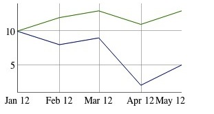
Let's take the example of wanting to add a synthetic column: Let's say I have a CSV file called data.csv that looks like so:
Date,A,B
2012/01/01,10,10
2012/02/01,12,8
2012/03/01,13,9
2012/04/01,11,2
2012/05/01,13,5
Perfect, that's easy enough to render using the smallest bit of Javascript:
Wow, that's simple.
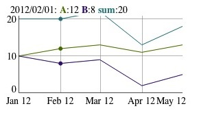
In our case, we're want to add a synthetic column to data.csv that takes the sum of A and B. Unfortunately, this means we can no longer have code as simple as new Dygraph(div, 'data.csv');
We're going to do three things:
1. Download the file
2. Parse its contents
3. Add the column
Downloading the file
When you specify a URL (or filename) in the Dygraph constructor, it fetches the content for you using XMLHttp, the backbone of Web 2.0. Here's the snippet required to fetch the content:
var req = new XMLHttpRequest();
req.onreadystatechange = function () {
if (req.readyState == 4) {
if (req.status === 200 || // Normal http
req.status === 0) { // Chrome w/ --allow-file-access-from-files
var data = req.responseText;
drawGraph(data);
}
}
};
req.open('GET', 'http://localhost:8000/data.csv', true);
req.send(null);
var drawGraph = function(data) {
console.log(typeof(data));
console.log(data);
new Dygraph(div, data);
}
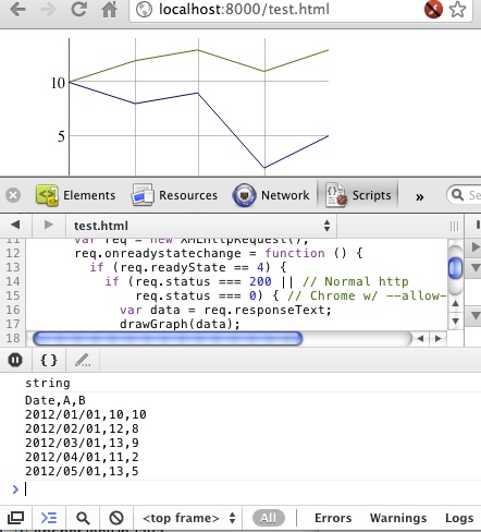
I added the console.log at the end just to demonstrate that the data is a String representation of the file.
I'm not going to go into detail about the XMLHttpRequest API - that's for experts in that domain to handle, and also, this document covers it. Suffice it to say that the callback is required since the XMLHTTPRequest is asynchronous. You can also read the private function start_ in dygraph.js.
Parsing the contents
So that first part wasn't so bad. Parsing the contents is going to be similarly easy. We're going to turn the CSV into an array. Go read the section in the Dygraphs Data Format document on arrays, and pay close attention to this piece of text:If you want your x-values to be dates, you'll need to use specify a Date object in the first column. Otherwise, specify a number. Here's a sample array with dates on the x-axis:So since in this case, the first column is a date, we'll have to turn it the values in the first column into Date objects, and turn our subsequent values into numbers.
var toArray = function(data) {
var lines = data.split("\n");
var arry = [];
for (var idx = 0; idx < lines.length; idx++) {
var line = lines[idx];
// Oftentimes there's a blank line at the end. Ignore it.
if (line.length == 0) {
continue;
}
var row = line.split(",");
// Special processing for every row except the header.
if (idx > 0) {
row[0] = new Date(row[0]); // Turn the string date into a Date.
for (var rowIdx = 1; rowIdx < row.length; rowIdx++) {
// Turn "123" into 123.
row[rowIdx] = parseFloat(row[rowIdx]);
}
}
arry.push(row);
}
return arry;
}
You'll also need to split out the header row as the labels option.
var drawGraph = function(data) {
var arry = toArray(data);
var firstRow = arry[0];
var data = arry.slice(1); // Remove first element (labels)
new Dygraph(div,data, { labels: firstRow });
}
This code sample doesn't address all cases for parsing. For instance, it
expects the first column to be a date string. If you want to know more
about how Dygraphs parses CSV, read the parseCSV_ function in dygraph.js.Adding the column
Now we have an array, it should be dead simple to add the additional column. Here's what we know:- The first row contains the headers, so we'll need to add an additional element to the header array.
- Each subsequent row in the array contains data, and those values will be in the row's second and third elements (indexes 1 and 2.)
var drawGraph = function(data) {
var arry = toArray(data);
var firstRow = arry[0];
var data = arry.slice(1);
firstRow.push("sum");
for (var idx = 0; idx < data.length; idx++) {
var row = data[idx];
var sum = row[1] + row[2];
row.push(sum);
}
new Dygraph(div,data, { labels: firstRow });
}
Addenda
- Oftentimes, people ask about the ability bypass the browser cache when fetching data to ensure the graph is always up to date. Since it's of related interested, I've included a reference to bypassing the cache here.
- Javascript libraries simplify the work around XMLHttp, so instead of having to write all the code above, you might want to invest some time in using jQuery (with its ajax function) or the Closure library.
- Don't forget that the URL you request for data needs to be on the same domain as the page requesting it, otherwise your XHR will be rejected.
- Javscript's parseFloat is not precisely the same as Dygraphs' own parseFloat_ method. Read the code for details.
Saturday, March 31, 2012
Testing from the Command Line with PhantomJS
Our current testing setup involves several steps:
- Start a jstd server from the command line.
- Visit the server in the browser that you want to test.
- Run the jstd command with "--tests all" set.
- Tear everything down.
With phantomjs, this process is streamlined. You can do everything from the command line:
$ ./test.sh
Ran 118 tests in 1.397s.
118 test(s) passed
0 test(s) failed:
PASSPhantom creates a headless web browser using WebKit. You drive the browser using JavaScript, and can execute commands in the context of any web page. I'm excited that it's working so well for dygraphs. No we'll have no excuses for not running auto_tests!
Monday, March 19, 2012
Swipe and pinch now work with Dygraphs!
Dan, inspired by his new iPad 3, did some weekend hacking and made pinch and zoom work in Dygraphs. This also worked on my Samsung Galaxy Nexus, although the new Chrome browser is much more responsive than the default one.
You can see this for yourself at http://dygraphs.com/tests/demo.html
Wednesday, March 14, 2012
JavaScript and Dates, What a Mess!
We recently had a dygraphs regression where a date specified as "2012-03-13" would be displayed as "2012-03-12 20:00" when you hovered over it (or something else depending on your time zone).
The culprit wound up being surprising behavior from JavaScript's Date parser. Here's the gist of the problem, via the Chrome JavaScript Console:
> new Date("2012/03/13")
Tue Mar 13 2012 00:00:00 GMT-0400 (EDT)
> new Date("2012-03-13")
Mon Mar 12 2012 20:00:00 GMT-0400 (EDT) So, why the discrepancy of four hours between these seemingly-identical dates? Here's another puzzler:
> new Date("2012-03-13")
Mon Mar 12 2012 20:00:00 GMT-0400 (EDT)
> new Date("2012-3-13")
Tue Mar 13 2012 00:00:00 GMT-0400 (EDT) Why does that extra zero in the first form subtract four hours?
I've run into many issues with new Date and Date.parse while working on dygraphs over the years. This issue inspired me to put together…
The Comprehensive Cross-Browser
JavaScript Date Parsing Table
On that page, you'll see how a variety of browsers do (or don't) parse particular date strings.
Here are some rules of thumb:
- Stick to "YYYY/MM/DD" for your date strings whenever possible. It's universally supported and unambiguous. With this format, all times are local.
- Avoid using hyphenated dates ("YYYY-MM-DD") unless you know what you're doing. Only newer browsers support them.
- So long as you specify four digits years, date strings at least have a unique parse across all browsers. Some browsers may return an error, but you won't get inconsistent behavior.
- Chrome tends to be more accepting than other browsers. If a date format parses in Chrome, you shouldn't assume that it parses anywhere else.
- If a recent browser can interpret as date string as ISO-8601, it will. With this format, your date/time string is interpreted as UTC.
With the table and these rules of thumb in hand, let's take another look at those mysterious Date parses from the beginning of the post:
> new Date("2012/03/13")
Tue Mar 13 2012 00:00:00 GMT-0400 (EDT) This parses to midnight in the local time zone. This behavior is universal across browsers.
> new Date("2012-03-13")
Mon Mar 12 2012 20:00:00 GMT-0400 (EDT) This can be interpreted as an ISO-8601 date, and so it is (following our last rule of thumb). This means that it is parsed as UTC. But it is displayed using local time. I'm in the EDT time zone, hence the difference of four hours. This format is only supported by newer browsers (Chrome, FF4+, IE9).
> new Date("2012-3-13")
Tue Mar 13 2012 00:00:00 GMT-0400 (EDT) This cannot be interpreted as an ISO-8601 date, since it's missing a "0" in front of the month ("3" vs. "03"). So Chrome falls back to interpreting this as a local time. At the moment, Chrome is the only browser which supports this particular gem of a format.
A final cautionary note: if you are writing a library and wish to convert date strings to millis since epoch, the built-in Date.parse method looks like just the ticket. But you'll eventually run into an issue. For reasons known only to its authors, MooTools overrides this function with an incompatible version (theirs returns a Date, not a number). What you really want is new Date(dateString).getTime().
So if you're writing a library and you get a date string from your user, what should you do with it? In dygraphs, the answer keeps getting more and more complicated.
Saturday, February 25, 2012
New feature: custom points
Dygraphs already provides a two options, drawPoints and pointSize, which will draw a small circle at every data point. Dygraphs will also draw points when hovering near a data set, and that circles size is determined by the option highlightCircleSize.
But who wants to be stuck with circles?
The drawPointCallback and drawHighlightPointCallback options both accept a function which draws the shape you want right on the canvas. As a starting point, Dygraphs now supplies a set of basic images. You can see all of them below:
Dygraph.Circles.DEFAULT Dygraph.Circles.TRIANGLE Dygraph.Circles.SQUARE Dygraph.Circles.DIAMOND Dygraph.Circles.PENTAGON Dygraph.Circles.HEXAGON Dygraph.Circles.CIRCLE Dygraph.Circles.STAR Dygraph.Circles.PLUS Dygraph.Circles.EX
The demo, which can be found here, also demonstrates drawing your own custom points, by drawing adorable little smiling and frowning faces.
More features are coming, so keep your eyes out for updates!
Wednesday, February 15, 2012
Custom lines, a new feature
A new series option strokePattern has been added to Dygraphs. This option allows you to define the pattern Dygraphs draws for a particular series. No longer are we limited to solid lines. It takes an even length integer array as a argument. This allows you to come up with any pattern you like for your series. This could be helpful if you have many series plots on one graph and you can not or do not want to use color alone to differentiate them. See the dygraphs per-series test page, and below for an example:
g = new Dygraph(element, data, {
legend: ‘always’,
strokeWidth: 2,
colors: [‘#0000FF’],
‘sine wave’: {
strokePattern: [7, 2, 2, 2]
}
}
);
The array defines the number of pixels that make up the drawn segments and space between them. It repeats the pattern throughout the line. The even indexes are drawn and the odd indexes are spaces. In pattern [7, 2, 2, 2] as shown in figure 2 below: seven pixels are drawn, there is a two pixel space, then two pixels are drawn then there is another two pixels space then it starts over again.
There are a few predefined patterns in Dygraphs. These are listed below, notice also when the pattern is null a solid line is used.
| Dygraph.DOTTED_LINE | [2, 2] |
|
| Dygraph.DASHED_LINE | [7, 3] |
|
| Dygraph.DOT_DASH_LINE | [7, 2, 2, 2] |
|
| null | null | ![]() |
Dygraphs will use the strokePattern when creating the legend. If the pattern can not fit into the legend width, the pattern will be scaled to fit. This may give you unexpected results depending on the pattern you use. As an example, patterns [10, 5] and [20, 10] will look the same in the legend because they will be scaled to fit into the same width. You may need to either choose patterns that are clear in the legend or use your own legend.
The new option strokePattern is a powerful new feature for dygraphs. I hope you find it useful for your graphs.
Wednesday, January 18, 2012
Preventing Dygraphs Memory Leaks
Spock is the kind of guy who preferred C++ with its destructors (let alone multiple inheritance), and that quote clinches it.
But it's also pretty easy to destroy in Dygraphs, you just have to remember to do it. And if you don't remember, you might have to pay a penalty.
Have you used the Dygraphs benchmark? It's a great tool for validating that your browser can handle large loads of dygraphs data. For instance, here's a URL that generates 50,000 points of data, which it tends to render in about half a second:
http://dygraphs.com/tests/dygraph-many-points-benchmark.html?points=100&series=500
Actually, today we aren't going to talk about Spock, or speed, we're going to talk about memory leaks.
Thanks to an excellent post on using the Chrome Inspector to diagnose and find memory leaks, we can see. Read that post to see how to track memory consumption. For this test, I used the URL above, and clicked "Go!" five times in a row (as opposed to setting repetitions=5)
Notice how over time, memory seems to go up, and never down. A sure sign of a memory leak.
The post also covers the notion of heap snapshots and how to compare multiple snapshots. So as a follow-up I took a heap snapshot, clicked "Go!" once, took another snapshot, and compared them.
So, the number of graphs increased by two. That means the browser is holding on to two more instances of Dygraph, DygraphLayout, DygraphCanvasRenderer, you name it, with each new rendering. That could be the cause of our memory leak! (Remember that the benchmark shows two graphs, one which is benchmarked, and another one to show the values of each benchmark test.)
Let's see how the graphs are created in dygraph-many-points-benchmark:
plot = new Dygraph(plotDiv, data, opts);
new Dygraph(
document.getElementById('metrics'),
durations,
{ ... });
The first one, upon deeper inspection, might be assigned to a local variable, but the variable is never used. In other words, with every iteration, that graph is just forgotten about.That's about when Dan told me about Dygraph.destroy. According to the method's documentation:
Detach DOM elements in the dygraph and null out all data references. Calling this when you're done with a dygraph can dramatically reduce memory usage. See, e.g., the tests/perf.html example.So I address that first case with the following change:
if (plot) { plot.destroy(); }
plot = new Dygraph(plotDiv, data, opts);
So now, before re-rendering the benchmark graph, the old graph is destroyed.
That second example, the one which stores durations of each benchmark, isn't even stored somewhere to be destroyed at a later time. However, rather than dispose that graph each time, I did something slightly different:
var metrics = null;
if (!metrics) {
metrics = new Dygraph(
document.getElementById('metrics'),
durations,
{ ... });
} else {
metrics.updateOptions({file: durations});
Here, instead of destroying and recreating the graph, I just reuse it, pushing in new values using the file option.
The result?
Steady memory usage. You can see a temporary bump which occurred at a period where I clicked Go! a little too quickly but even that memory was reclaimed. If you zoom in on the image, you can see small hiccups in the memory use every time I regenerated the graphs.
The takeaways:
- Don't assume your graphs are being destroyed when you no longer hold references to them.
- Hold references to your graphs so you can destroy them with Dygraph.destroy.
- Use updateOptions to replace graph data rather than constantly build new graphs.
- Go read the post on diagnosing memory leaks in Chrome. Go.