Monday, December 31, 2012

Changes to the Experimental Palette

Hey Dygraphers,

I've been working on some bugs and features, and while at it, been pushing some nice new features into the experimental palette that makes it eminently more useful. Let's take a tour. You can play along at http://www.dygraphs.com/experimental/palette

1. Option Set drop-down
Using the Option Set dropdown on the palette, you can configure any axis or series that you like.

Go ahead and select line (series). You'll see a subset of the options that apply to individual series.


2. Move the line series to the second y-axis.

In the axis text box, type "y2" and press "enter" (or click Redraw, if you prefer.) The second axis will appear.

3. Configure the second y-axis.

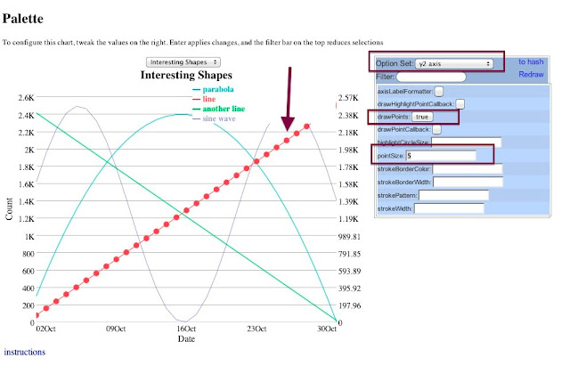
The line is on the second y-axis, but it's not obvious. Let's make all series on the second y-axis stand out. Select y2 axis from the Option Set drop-down, and set drawPoints to true, and and pointSize to 5. Click Redraw. Presto!


4. View the options as a hash.
On the top-right of the palette is a link "to hash". Click it, and the options text box appears.


5. Change the options as a text object.

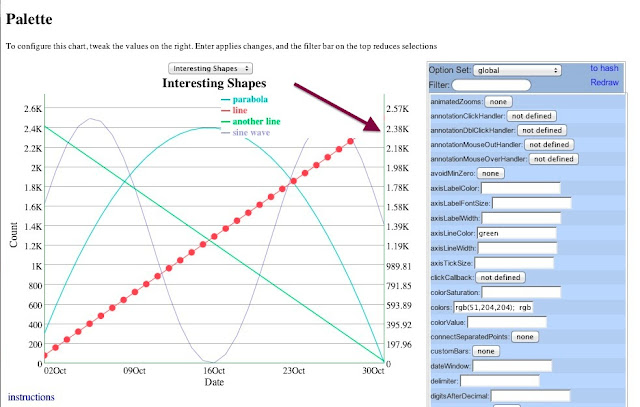
Sometimes tweaking via the object hash is the way to go. In the text box, change axisLineColor from white to green. Then click OK.

OK I didn't pick the best example because it's hard to see, but this axis is green.


Let's zoom in:
There you go! (hmm... why is there a little red in the axis?) Probably to help celebrate the christmas spirit. Happy New Year!

Tuesday, December 25, 2012

Dygraphs 2012 Year in Review


2012 was a busy year for Dygraphs.

We had almost 400 commits over the year (with a month to go, no less.)  And something you'll notice is that this year we had a _huge_ number of external contributors. So first and foremost, thank you to everybody who contributed to Dygraphs.
Robert Konigsberg: 175
Dan Vanderkam: 137
Klaus Weidner: 30
Adam Vartanian: 5
Uemit Seren: 5
Josep LlodrĂ : 4
David Moena: 3
Joshua: 3
Paul Felix: 3
Beda Kosata: 2
Jason Hollingsworth: 2
Wim Bruynooghe: 2
wimme: 2
David M Sibley: 1
David Watrous: 1
Helder: 1
James H Thompson: 1
Matt Miller: 1
Richard Klemm: 1
Russell Valentine: 1
bluthen: 1
mbghsource: 1
shole: 1
timeu: 1

Here's an overview of the major new features:
What a great year! See you in 2013.

Saturday, December 1, 2012

The New and Better Way to Specify Series and Axis Options

TL;DR: Put series inside the series option. If you want to put a series on the second y-axis, then inside that series specify axis : 'y2'. You can say that a series belongs on the first y-axis with axis : 'y', but that's also the default. This only applies inside the series option. Also, per-series options can also be specified in an axis, so it applies to every series on that axis.

In a recent post, I described the bizarre behavior required to make multiple axes work. Fortunately, because of the experience writing the post, I submitted a series of patches that rewrote the internals for handling options processing, and also improve the API.

Specifying a Series

Traditionally, per-series options were specified on the top-level of the options dictionary, like so:

{
  pointSize : 5,
  legend : 'always',
  T : {
    pointSize : 6
  }
}

This behavior is now discouraged. Instead you should put your per-series options in the top-level series option:

{
  pointSize : 5,
  legend : 'always',
  series : {
    T : {
      pointSize : 6
    }
  }
}

Now, if you want to deal with multiple axes, pay close attention, because things have changed.

It used to be that if you wanted to specify that a series was on the second y-axis, you did this:

T : {
  axis : { }
}

And then if you wanted to put another series on the second y-axis, you would reference the first series, like so:

S : {
  axis : 'T'
}

This behavior still works, until you put it inside the series option.

So let's say you had 

{
  pointSize : 5,
  legend : 'always',
  T : {
    axis : { }
  },
  S : {
    axis : 'T'
  }
}

and then you moved it into the series option:

{
  pointSize : 5,
  legend : 'always',
  series : {
    T : {
      axis : { }
    },
    S : {
      axis : 'T'
    }
  }
}
... the graph would fail to render, with the exception
"Using objects for axis specification is not supported inside the 'series' option."
That's because we did per-axis specifications right this time. All you have to do is directly specify the axis you want a series to appear on, like so:

{
  pointSize : 5,
  legend : 'always',
  series : {
    T : {
     axis : 'y2'
    },
    S : {
      axis : 'y2'
    }
  }
}


No more weird {}, and no more referencing other series.


Remember, behavior inside the series option is different from outside. The outside-series options have been effectively deprecated. However, all the old behavior has been preserved. so your old graphs will still work. It's different from the old way, but it's easier to use.

Specifying Per-series options on an axis

As I mentioned at the top, options parsing has been rewritten. This allowed for a nice small change, which is the rule in which options are found:
When searching for a per-series option, first see if it's specified in the series. If it's not there, see if there's an option for it on the axis. If it's not there look for a user-specified option, and then finally rely on a default value.
This implies the new rule for finding per-axis options:
When searching for a per-axis option, first see if it's specified in the axis. If it's not there, look for a user-specified option, and then finally, rely on a default value.
Make sense? Let's look at a demo:

{
  drawPoints : true,
  pointSize : 5,
  legend : 'always',
  series : {
    T : {
      axis : 'y2',
      pointSize : 10
    },
    S : {
      axis : 'y2'
    }
  },
  axes : {
    'y2' : {
      drawPointCallback: Dygraph.Circles.PENTAGON
    }
  }
});

In this case,  notice that series T and S are both on the y2 axis. The point size is overridden for T by being specified directly in T. However, both S and T have pentagons for points because of the drawPointCallback specification in axes.

Friday, November 23, 2012

Using the second y-axis

Short summary: Consider all the series you want on the right-side axis. Choose one as (for lack of a better term) the master series. For that series, add the option axis : {}. For the others, use axis : 'T', replacing T with the master series' name. Yes, we know this is confusing, and we have some ideas for fixing it.

Update: The behavior for specifying a second y-axis has been simplified. See this recent post.

One of the nice new features Dan added to Dygraphs was the ability to use a second y-axis. Unfortunately, we all agree the mechanism to specify using the second y-axis is a little confusing, so this post ought to make things easier to understand.

Take note, though, that we're working out a proposal to make using the second y-axis easier to understand, so please feel free to read and comment as you see fit. (Once we simplify the API for using the second y-axis, this post will be obsolete, but hopefully it'll be replaced by another one. (Remind me to add references to this post when that time comes.))

Demonstration: Here's a graph with three series (named R, S and T), all on the left-side y-axis.

To move one of the series to the right-side y-axis, you need to add an option for the series. For instance, let's move series T to the right-side:
T : {
  axis : { }
}

The short explanation of what this means is that it instructs Dygraphs to create a new axis, and assign T to it.

Which looks like this:

You might think that if you wanted to add S to the right axis you would add
S : {
  axis : { }
}
but if you did, you would get this error:

dygraphs: Only two y-axes are supported at this time. (Trying to use 3) (axes.js:65:7) 

Yeah, confusing. Instead, what you do is:
S : {
  axis : 'T'
}
This says that whatever axis T is on, put S there too.

Here's what it looks like:

Sunday, August 5, 2012

HTML5 Charting Tool Performance Comparison

Akram El Assas has written up a performance comparison of dygraphs and a few other HTML5 charting libraries over at CodeProject.

dygraphs has always been written with large data sets in mind, and so it does quite well on these benchmarks. The one million point benchmark is particularly good:

dygraphs was the only library to complete the 1M point benchmark on 3/5 browsers, and was 6x faster than the competition on one of the others. There are a few tricks that we use to keep dygraphs running fast on large data sets. These are mostly under-the-hood, but they'll be great fodder for a future blog post.


Wednesday, August 1, 2012

Introducing Custom Plotters

Once you get your chart displaying with dygraphs, you'll want to customize its appearance.

dygraphs includes a plethora of options for doing simple customization, e.g. colors, strokeWidth, drawPoints, stackedGraph and fillGraph. You can see examples of all of these in use from the links off the options reference, or you can play around with them yourself using the experimental palette.

But what if you want to do something really crazy? To fundamentally change the way that data series are displayed? We've recently added a new plotter option which lets you customize to your heart's content.

The standard plotter just draws lines from point to point. While it's a bit more complex in reality, in essence, it's just this:

g = new Dygraph(div, data, {
  plotter: function(e) {
    var ctx = e.drawingContext;
    ctx.beginPath();
    ctx.moveTo(e.points[0].canvasx, e.points[0].canvasy);
    for (var i = 1; i < e.points.length; i++) {
      var p = e.points[i];
      ctx.lineTo(p.canvasx, p.canvasy);
    }
    ctx.stroke();
  }
});
(View/Edit in jsFiddle)

The plotter is called once for each series that needs to be drawn. Its one parameter is a dictionary of useful data about the series and the dygraph. The essential properties are the ones which we use here, namely:

  • drawingContext: a <canvas> drawing context on which you should render this series.
  • points: an array containing the individual points to draw. Each entry has a canvasx and canvasy attribute which tells you where to draw the point.

dygraphs will set up the drawing context for you as best it can. There's no need for you to set the stoke width or color for each series unless you want to do something unusual.

Other properties passed to the plotter include:

  • setName: the name of the series being drawn, e.g. "Y2"
  • color: the color of the series being drawn (you won't normally need this, see above)
  • strokeWidth: the width of the line being drawn (again, you won't normally need this, see above)
  • dygraph: A reference to current dygraph object (useful for calling getOption() and friends)
  • plotArea: Contains x, y, w and h properties which define the plotting rectangle.

As a simple example of what a custom plotter can do, let's make dygraphs draw bar charts instead of line charts.

Here's a bar chart plotter:

function barChartPlotter(e) {
  var ctx = e.drawingContext;
  var points = e.points;
  var y_bottom = e.dygraph.toDomYCoord(0);  // see http://dygraphs.com/jsdoc/symbols/Dygraph.html#toDomYCoord

  // This should really be based on the minimum gap
  var bar_width = 2/3 * (points[1].canvasx - points[0].canvasx);
  ctx.fillStyle = e.color;

  // Do the actual plotting.
  for (var i = 0; i < points.length; i++) {
    var p = points[i];
    var center_x = p.canvasx;  // center of the bar

    ctx.fillRect(center_x - bar_width / 2, p.canvasy,
        bar_width, y_bottom - p.canvasy);
    ctx.strokeRect(center_x - bar_width / 2, p.canvasy,
        bar_width, y_bottom - p.canvasy);
  }
}

And a dygraph that uses it:

g = new Dygraph(div, data, {
  plotter: barChartPlotter,
  dateWindow: [0, 9]  // avoid clipping first and last bars
});

and here's what the output looks like:

(View/Edit in jsFiddle)

Pretty easy! And since this is dygraphs, you get nice things like (animated) zooming, panning and hover labels for free. Try it out by clicking and dragging to zoom, or holding down shift and dragging to pan.

You can mix and match different plotters by setting the plotter option on a per-series basis. Here's how you might combine a line and bar chart (aka a Pareto chart):

g = new Dygraph(div, data, {
  "Late Arrivals": {
    plotter: barChartPlotter
  },
});
(View/Edit in jsFiddle)

This is admittedly a bit simplified: a real Pareto chart would list causes on the x-axis (instead of numbers) and would use two y-axes. In a future post, we'll try to recreate this Wikipedia Pareto chart more precisely using a valueFormatter and a secondary y-axis.

In the mean time, check out the plotters demo for some examples of how to use this exciting new tool.
Friday, May 4, 2012

Canvas Adoption in Major Browsers

(if you're reading this in an RSS reader, come to the blog to see some nice charts!)

dygraphs is based around the <canvas> tag, which first appeared in Safari in 2004. It was quickly adopted by other browsers, with one notable exception.

When I initially wrote dygraphs in 2006, Internet Explorer market share was 80–90%. When I released it in late 2009, <canvas> was still supported in less than 50% of browsers. Recently, however, that has been changing dramatically:

With over 80% of browsers supporting it, the conventional wisdom that <canvas> is not "safe" to use needs some rethinking!

There are two drivers of this phenomenon.

The first is Google Chrome. Since its debut in 2008, Chrome has achieved over 30% market share. Over the same time span, Firefox has gone from 26% to 25%. Nearly all of Chrome's gains, in other words, have been coming from IE:

The other driver was the introduction of IE9, the first version of Internet Explorer to support <canvas>:

Firefox and Chrome have been increasing <canvas> support for years by eating away at IE's market share. IE9 has accelerated the trend by making Internet Explorer a better browser.

What does this all add up to? It means that hacks like excanvas won't be necessary for much longer, as more and more web users get a first class dygraphs experience.

Data source: statcounter